Journal
- 2026
- June
- March
- 2025
- December
- November
- July
- June
- May
- March
- February
- 2024
- December
- September
- August
- May
- 2023
- September
- August
- March
- 2022
- December
- October
- September
- August
- July
- June
- May
- April
- February
- January
- 2021
- November
- September
- August
- June
- May
- April
- March
- February
- January
- 2020
- December
- August
- July
- June
- May
- April
- March
- February
- January
- 2019
- December
- November
- October
- September
- August
- July
- June
- April
- March
- February
- January
- 2018
- December
- November
- October
- September
- August
- July
- June
- May
- April
- March
- February
- January
- 2017
- December
- November
- October
- September
- August
- July
- June
- May
- April
- March
- February
- January
- 2016
- December
- November
- October
- September
- August
- July
- June
- May
- April
- March
- February
- January
- 2015
- December
- November
- October
- September
- August
- June
- April
- 2014
- October
- September
- July
- June
- May
- March
- February
- January
- 2013
- November
- September
- August
- July
- June
- May
- April
- March
- February
- 2012
- December
- November
- October
- September
- August
- July
- June
- May
- April
- 2011
- December
- October
- September
- 2018 trends (4)
- 2021 Trends (2)
- 2022 trends (1)
- 2023 trends (3)
- 2025 trends (2)
- accent room (1)
- accessories (3)
- amy schuermann interiors (27)
- amy youngblood (1)
- amy youngblood interiors (43)
- Amy Youngblood Interiors (24)
- amy youngblood schuermann interior designs (2)
- Amy Youngblood Schuermann Interior Designs (1)
- art (8)
- art deco (6)
- artwork (2)
- atmosphere (31)
- awards (3)
- ayi team (6)
- back to school (3)
- basement (1)
- bathroom (4)
- bathroom organization (1)
- bedroom (5)
- bench seating (1)
- BLING Boutique (1)
- bold (6)
- brass (1)
- budget (1)
- Built-ins (1)
- channel 9 (1)
- children's room (2)
- christmas (9)
- cincinnati (16)
- Cincinnati (3)
- Cincinnati full-service interior design (1)
- Cincinnati Home (5)
- Cincinnati interior design (1)
- Cincinnati's best interior designer (1)
- cincy lifestyle (2)
- Cincy Lifestyle (2)
- classic design trends (5)
- color (3)
- color trends (15)
- Color trends (1)
- commercial design (4)
- commercial interior design (1)
- community (1)
- concrete (1)
- condo (1)
- COVID (1)
- cozy (9)
- cubbies (2)
- custom (1)
- custom design (6)
- custom window treatments (1)
- declutter (1)
- decor (36)
- decorating (5)
- defined spaces (1)
- design (29)
- design vision (1)
- designbuildcincy (2)
- Dining table choices (1)
- donate (1)
- dramatic (3)
- durability (6)
- eco-friendly design (2)
- elevate (1)
- entertaining (22)
- entertainment (3)
- entry rug (1)
- entryway (7)
- environmental design (2)
- event (1)
- events (20)
- fabric (4)
- fall (14)
- fall interior design trends (1)
- family room (3)
- fashion (2)
- Female Business Owners (1)
- fire pit (1)
- fireplace (1)
- flowers (1)
- functional (6)
- functionality (3)
- Furniture (3)
- Gallery Wall (1)
- gallery wall (1)
- garage (1)
- gifts (1)
- give back (1)
- good cause (1)
- granite (2)
- green design (3)
- guest bathroom design (1)
- guest bedroom (1)
- Halloween (1)
- hearth room (1)
- high point (2)
- holiday decorating (1)
- holiday planning (11)
- home office (2)
- home renovation (39)
- Home Renovation (4)
- hospitality design (1)
- houzz (1)
- how to get started (25)
- How to get started (2)
- hyde park (5)
- hygge (1)
- Indigo Hippo (1)
- indoor plants (3)
- inspiratiom (3)
- inspiration (89)
- interior design (120)
- Interior Design (4)
- interior design mistakes (1)
- interior design project (1)
- interior design trends (47)
- Interior Design Trends (2)
- junior league of cincinnati (2)
- Kids Bathroom (1)
- kitchen (7)
- Laminates (1)
- LEED (1)
- LEED Design (1)
- light fixtures (6)
- lighting (14)
- lighting design (1)
- Live in the Movement (1)
- living room (5)
- marble (1)
- marketing (1)
- metallics (7)
- metals (2)
- midcentury modern (6)
- mood (2)
- mt.lookout (2)
- mudroom (2)
- natural (7)
- nature (8)
- Nature (1)
- nature inspired (1)
- neocon (1)
- neutral (10)
- Neutral (1)
- New Life Furniture Bank (1)
- nonprofit (3)
- office (3)
- office design (1)
- office space design (2)
- open concept (2)
- organization (11)
- organize (3)
- otr (1)
- outdoor (9)
- Outdoor design tips (2)
- outdoor furniture (2)
- outdoor interior design (3)
- Outdoor kitchens (1)
- over the rhine (1)
- paint (12)
- paint colors (1)
- paint trends (2)
- palette (14)
- party (9)
- patio (7)
- pattern (8)
- Pelle Medical Skincare (1)
- performance (1)
- personal training (1)
- philosophy (3)
- Philosophy (1)
- pillows (2)
- plants (2)
- pop of color (2)
- powder room (2)
- powder room design (1)
- project management (2)
- projects (4)
- publications (9)
- quality furniture (2)
- quartz (2)
- Quartz (1)
- reclaimed wood (1)
- relax (1)
- remodel (2)
- remodeling (9)
- remote learning (1)
- remote learning design solutions (1)
- renovation (12)
- residential design (12)
- residential interior design (6)
- residential vs commercial materials (1)
- restaurant (1)
- restaurant design (1)
- retro (2)
- rug (3)
- rugs (3)
- semi-open floor plan (1)
- space planning (7)
- spring cleaning (1)
- spring design trends (3)
- Spring Design Trends (1)
- stone (1)
- storage (11)
- style (67)
- Style (2)
- summer (1)
- summer design (1)
- summer outdoor entertaining (4)
- sustainable (1)
- terrazzo (1)
- texture (2)
- thanksgiving (4)
- tile (4)
- tour of kitchens (3)
- travel (1)
- trends (39)
- unique (4)
- unique design feature (1)
- wallpaper (11)
- walnut hills (1)
- warm tones (1)
- window treatments (2)
- winter (6)
- wood (2)
- wood flooring (4)
- world travels (1)
- yellow (1)
6 Colors We Prefer Over Pantone's Greenery
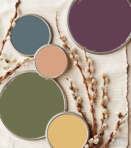
Pantone is a company that specializes in matching colors. Pantone began as a company that originally helped to specify printer ink and now is known for its role in matching colors among the auto, paint, and textile industries. They are very influential in the world of design. Every January they come out with a “color of the year.” This color is supposed to forecast trends that will be prevalent in the fashion, auto, and interior design world. Most often Pantone is right on point, but this year we think they missed the mark.
Here is a list of colors we, at Amy Youngblood Interiors, prefer more than Pantone’s 2017 color of Greenery.
- Love Potion
This deep magenta is very trendy in fashion. It’s super rich and beautiful. We’re seeing a lot of nice dresses this color this year.
- Gypsum
Gypsum is a silvery white. This fresh hue would have been a better pick for Pantone.
- Superstition
Superstition is a beautiful navy color that looks great in any space. Navy has been very popular among home décor and car colors recently.
- Clay fire
Clay fire is a terracotta color that is being seen in lots of bedding. It’s beautiful paired with teal or a dark plum.
- Tropical siesta
This dandelion yellow is very eye-catching. It’s a refreshing hue.
- Toy tank green
Toy Tank Green is an olive color that is very popular right now. It’s being used in nail polish and in outerwear.