Journal
- 2026
- June
- March
- 2025
- December
- November
- July
- June
- May
- March
- February
- 2024
- December
- September
- August
- May
- 2023
- September
- August
- March
- 2022
- December
- October
- September
- August
- July
- June
- May
- April
- February
- January
- 2021
- November
- September
- August
- June
- May
- April
- March
- February
- January
- 2020
- December
- August
- July
- June
- May
- April
- March
- February
- January
- 2019
- December
- November
- October
- September
- August
- July
- June
- April
- March
- February
- January
- 2018
- December
- November
- October
- September
- August
- July
- June
- May
- April
- March
- February
- January
- 2017
- December
- November
- October
- September
- August
- July
- June
- May
- April
- March
- February
- January
- 2016
- December
- November
- October
- September
- August
- July
- June
- May
- April
- March
- February
- January
- 2015
- December
- November
- October
- September
- August
- June
- April
- 2014
- October
- September
- July
- June
- May
- March
- February
- January
- 2013
- November
- September
- August
- July
- June
- May
- April
- March
- February
- 2012
- December
- November
- October
- September
- August
- July
- June
- May
- April
- 2011
- December
- October
- September
- 2018 trends (4)
- 2021 Trends (2)
- 2022 trends (1)
- 2023 trends (3)
- 2025 trends (2)
- accent room (1)
- accessories (3)
- amy schuermann interiors (27)
- amy youngblood (1)
- amy youngblood interiors (43)
- Amy Youngblood Interiors (24)
- amy youngblood schuermann interior designs (2)
- Amy Youngblood Schuermann Interior Designs (1)
- art (8)
- art deco (6)
- artwork (2)
- atmosphere (31)
- awards (3)
- ayi team (6)
- back to school (3)
- basement (1)
- bathroom (4)
- bathroom organization (1)
- bedroom (5)
- bench seating (1)
- BLING Boutique (1)
- bold (6)
- brass (1)
- budget (1)
- Built-ins (1)
- channel 9 (1)
- children's room (2)
- christmas (9)
- cincinnati (16)
- Cincinnati (3)
- Cincinnati full-service interior design (1)
- Cincinnati Home (5)
- Cincinnati interior design (1)
- Cincinnati's best interior designer (1)
- cincy lifestyle (2)
- Cincy Lifestyle (2)
- classic design trends (5)
- color (3)
- color trends (15)
- Color trends (1)
- commercial design (4)
- commercial interior design (1)
- community (1)
- concrete (1)
- condo (1)
- COVID (1)
- cozy (9)
- cubbies (2)
- custom (1)
- custom design (6)
- custom window treatments (1)
- declutter (1)
- decor (36)
- decorating (5)
- defined spaces (1)
- design (29)
- design vision (1)
- designbuildcincy (2)
- Dining table choices (1)
- donate (1)
- dramatic (3)
- durability (6)
- eco-friendly design (2)
- elevate (1)
- entertaining (22)
- entertainment (3)
- entry rug (1)
- entryway (7)
- environmental design (2)
- event (1)
- events (20)
- fabric (4)
- fall (14)
- fall interior design trends (1)
- family room (3)
- fashion (2)
- Female Business Owners (1)
- fire pit (1)
- fireplace (1)
- flowers (1)
- functional (6)
- functionality (3)
- Furniture (3)
- Gallery Wall (1)
- gallery wall (1)
- garage (1)
- gifts (1)
- give back (1)
- good cause (1)
- granite (2)
- green design (3)
- guest bathroom design (1)
- guest bedroom (1)
- Halloween (1)
- hearth room (1)
- high point (2)
- holiday decorating (1)
- holiday planning (11)
- home office (2)
- home renovation (39)
- Home Renovation (4)
- hospitality design (1)
- houzz (1)
- how to get started (25)
- How to get started (2)
- hyde park (5)
- hygge (1)
- Indigo Hippo (1)
- indoor plants (3)
- inspiratiom (3)
- inspiration (89)
- interior design (120)
- Interior Design (4)
- interior design mistakes (1)
- interior design project (1)
- interior design trends (47)
- Interior Design Trends (2)
- junior league of cincinnati (2)
- Kids Bathroom (1)
- kitchen (7)
- Laminates (1)
- LEED (1)
- LEED Design (1)
- light fixtures (6)
- lighting (14)
- lighting design (1)
- Live in the Movement (1)
- living room (5)
- marble (1)
- marketing (1)
- metallics (7)
- metals (2)
- midcentury modern (6)
- mood (2)
- mt.lookout (2)
- mudroom (2)
- natural (7)
- nature (8)
- Nature (1)
- nature inspired (1)
- neocon (1)
- neutral (10)
- Neutral (1)
- New Life Furniture Bank (1)
- nonprofit (3)
- office (3)
- office design (1)
- office space design (2)
- open concept (2)
- organization (11)
- organize (3)
- otr (1)
- outdoor (9)
- Outdoor design tips (2)
- outdoor furniture (2)
- outdoor interior design (3)
- Outdoor kitchens (1)
- over the rhine (1)
- paint (12)
- paint colors (1)
- paint trends (2)
- palette (14)
- party (9)
- patio (7)
- pattern (8)
- Pelle Medical Skincare (1)
- performance (1)
- personal training (1)
- philosophy (3)
- Philosophy (1)
- pillows (2)
- plants (2)
- pop of color (2)
- powder room (2)
- powder room design (1)
- project management (2)
- projects (4)
- publications (9)
- quality furniture (2)
- quartz (2)
- Quartz (1)
- reclaimed wood (1)
- relax (1)
- remodel (2)
- remodeling (9)
- remote learning (1)
- remote learning design solutions (1)
- renovation (12)
- residential design (12)
- residential interior design (6)
- residential vs commercial materials (1)
- restaurant (1)
- restaurant design (1)
- retro (2)
- rug (3)
- rugs (3)
- semi-open floor plan (1)
- space planning (7)
- spring cleaning (1)
- spring design trends (3)
- Spring Design Trends (1)
- stone (1)
- storage (11)
- style (67)
- Style (2)
- summer (1)
- summer design (1)
- summer outdoor entertaining (4)
- sustainable (1)
- terrazzo (1)
- texture (2)
- thanksgiving (4)
- tile (4)
- tour of kitchens (3)
- travel (1)
- trends (39)
- unique (4)
- unique design feature (1)
- wallpaper (11)
- walnut hills (1)
- warm tones (1)
- window treatments (2)
- winter (6)
- wood (2)
- wood flooring (4)
- world travels (1)
- yellow (1)
Pantone Color of the Year 2018
You might recall 2017's color of the year, which was Greenery, a vibrant and bright shade of green that popped up in design trends everywhere throughout the year. We saw it heavily influencing the botanical trend and the theme of nature-inspired decor. 2017 was all about bringing a little of the outdoors in.
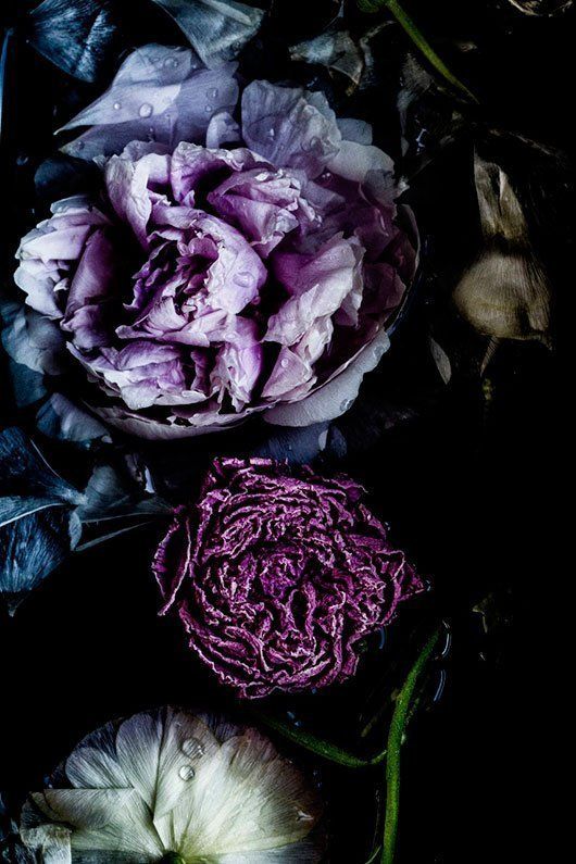
This year, Pantone has gone in a totally new direction with their choice for 2018. Moving away from greens on the color wheel, Pantone has selected Ultra Violet, a bold and vibrant shade of purple. A little unexpected, and maybe a little too bold for some, ultra violet definitely stirs up mixed emotions. Love it or hate it, expect to see a lot of purple in 2018.
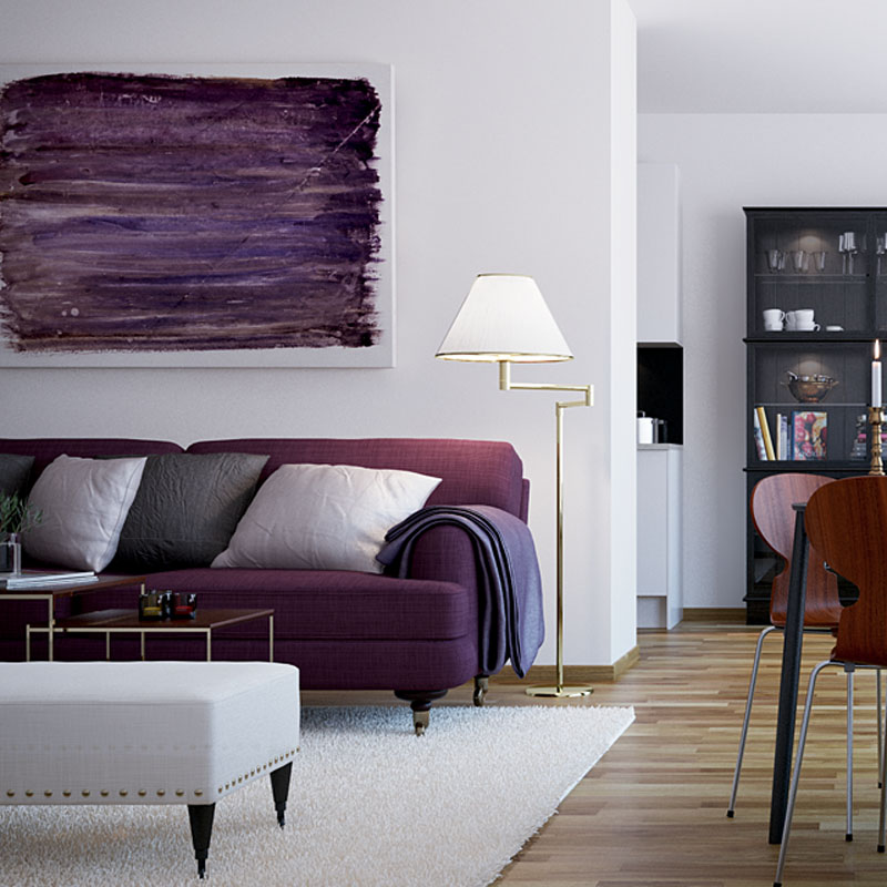
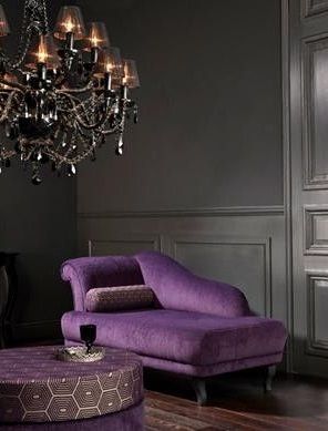
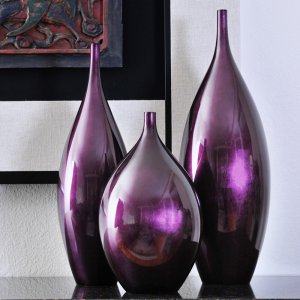
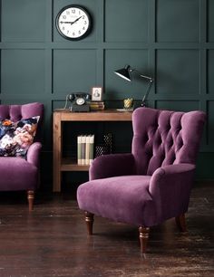
Purple can be seen as a difficult color to work with in the home, but it's quite evident that it can be elegantly, as well as modernly, done. Purple is a royal color, a color of sophistication and richness. It can be dramatic and romantic, bold and bright, or soft and playful.
However, if you are still feeling hesitant on working with this daring color, try working it your space in a subtle way. Think about the finer details. Add in a touch of purple with an accent pillow or maybe incorporate it within a pattern. Look for glass details, such as vases or bowls. Purple can even come into play with floral arrangements and artwork. Blended with metallic elements, ultra violet feels luxurious and inviting.
If you have no hesitations about purple at all, then this is your moment to go bold! Look for accent furniture pieces that can really set off a space, such as an armchair. Look for rich and soft textures in upholstery, such as velvet. You could even look for a show-stopping wallpaper for an accent wall that plays with shades of purple.
Looking for more inspiration? Here are a few images that caught our eye!