Journal
- 2026
- June
- March
- 2025
- December
- November
- July
- June
- May
- March
- February
- 2024
- December
- September
- August
- May
- 2023
- September
- August
- March
- 2022
- December
- October
- September
- August
- July
- June
- May
- April
- February
- January
- 2021
- November
- September
- August
- June
- May
- April
- March
- February
- January
- 2020
- December
- August
- July
- June
- May
- April
- March
- February
- January
- 2019
- December
- November
- October
- September
- August
- July
- June
- April
- March
- February
- January
- 2018
- December
- November
- October
- September
- August
- July
- June
- May
- April
- March
- February
- January
- 2017
- December
- November
- October
- September
- August
- July
- June
- May
- April
- March
- February
- January
- 2016
- December
- November
- October
- September
- August
- July
- June
- May
- April
- March
- February
- January
- 2015
- December
- November
- October
- September
- August
- June
- April
- 2014
- October
- September
- July
- June
- May
- March
- February
- January
- 2013
- November
- September
- August
- July
- June
- May
- April
- March
- February
- 2012
- December
- November
- October
- September
- August
- July
- June
- May
- April
- 2011
- December
- October
- September
- 2018 trends (4)
- 2021 Trends (2)
- 2022 trends (1)
- 2023 trends (3)
- 2025 trends (2)
- accent room (1)
- accessories (3)
- amy schuermann interiors (27)
- amy youngblood (1)
- amy youngblood interiors (43)
- Amy Youngblood Interiors (24)
- amy youngblood schuermann interior designs (2)
- Amy Youngblood Schuermann Interior Designs (1)
- art (8)
- art deco (6)
- artwork (2)
- atmosphere (31)
- awards (3)
- ayi team (6)
- back to school (3)
- basement (1)
- bathroom (4)
- bathroom organization (1)
- bedroom (5)
- bench seating (1)
- BLING Boutique (1)
- bold (6)
- brass (1)
- budget (1)
- Built-ins (1)
- channel 9 (1)
- children's room (2)
- christmas (9)
- cincinnati (16)
- Cincinnati (3)
- Cincinnati full-service interior design (1)
- Cincinnati Home (5)
- Cincinnati interior design (1)
- Cincinnati's best interior designer (1)
- cincy lifestyle (2)
- Cincy Lifestyle (2)
- classic design trends (5)
- color (3)
- color trends (15)
- Color trends (1)
- commercial design (4)
- commercial interior design (1)
- community (1)
- concrete (1)
- condo (1)
- COVID (1)
- cozy (9)
- cubbies (2)
- custom (1)
- custom design (6)
- custom window treatments (1)
- declutter (1)
- decor (36)
- decorating (5)
- defined spaces (1)
- design (29)
- design vision (1)
- designbuildcincy (2)
- Dining table choices (1)
- donate (1)
- dramatic (3)
- durability (6)
- eco-friendly design (2)
- elevate (1)
- entertaining (22)
- entertainment (3)
- entry rug (1)
- entryway (7)
- environmental design (2)
- event (1)
- events (20)
- fabric (4)
- fall (14)
- fall interior design trends (1)
- family room (3)
- fashion (2)
- Female Business Owners (1)
- fire pit (1)
- fireplace (1)
- flowers (1)
- functional (6)
- functionality (3)
- Furniture (3)
- Gallery Wall (1)
- gallery wall (1)
- garage (1)
- gifts (1)
- give back (1)
- good cause (1)
- granite (2)
- green design (3)
- guest bathroom design (1)
- guest bedroom (1)
- Halloween (1)
- hearth room (1)
- high point (2)
- holiday decorating (1)
- holiday planning (11)
- home office (2)
- home renovation (39)
- Home Renovation (4)
- hospitality design (1)
- houzz (1)
- how to get started (25)
- How to get started (2)
- hyde park (5)
- hygge (1)
- Indigo Hippo (1)
- indoor plants (3)
- inspiratiom (3)
- inspiration (89)
- interior design (120)
- Interior Design (4)
- interior design mistakes (1)
- interior design project (1)
- interior design trends (47)
- Interior Design Trends (2)
- junior league of cincinnati (2)
- Kids Bathroom (1)
- kitchen (7)
- Laminates (1)
- LEED (1)
- LEED Design (1)
- light fixtures (6)
- lighting (14)
- lighting design (1)
- Live in the Movement (1)
- living room (5)
- marble (1)
- marketing (1)
- metallics (7)
- metals (2)
- midcentury modern (6)
- mood (2)
- mt.lookout (2)
- mudroom (2)
- natural (7)
- nature (8)
- Nature (1)
- nature inspired (1)
- neocon (1)
- neutral (10)
- Neutral (1)
- New Life Furniture Bank (1)
- nonprofit (3)
- office (3)
- office design (1)
- office space design (2)
- open concept (2)
- organization (11)
- organize (3)
- otr (1)
- outdoor (9)
- Outdoor design tips (2)
- outdoor furniture (2)
- outdoor interior design (3)
- Outdoor kitchens (1)
- over the rhine (1)
- paint (12)
- paint colors (1)
- paint trends (2)
- palette (14)
- party (9)
- patio (7)
- pattern (8)
- Pelle Medical Skincare (1)
- performance (1)
- personal training (1)
- philosophy (3)
- Philosophy (1)
- pillows (2)
- plants (2)
- pop of color (2)
- powder room (2)
- powder room design (1)
- project management (2)
- projects (4)
- publications (9)
- quality furniture (2)
- quartz (2)
- Quartz (1)
- reclaimed wood (1)
- relax (1)
- remodel (2)
- remodeling (9)
- remote learning (1)
- remote learning design solutions (1)
- renovation (12)
- residential design (12)
- residential interior design (6)
- residential vs commercial materials (1)
- restaurant (1)
- restaurant design (1)
- retro (2)
- rug (3)
- rugs (3)
- semi-open floor plan (1)
- space planning (7)
- spring cleaning (1)
- spring design trends (3)
- Spring Design Trends (1)
- stone (1)
- storage (11)
- style (67)
- Style (2)
- summer (1)
- summer design (1)
- summer outdoor entertaining (4)
- sustainable (1)
- terrazzo (1)
- texture (2)
- thanksgiving (4)
- tile (4)
- tour of kitchens (3)
- travel (1)
- trends (39)
- unique (4)
- unique design feature (1)
- wallpaper (11)
- walnut hills (1)
- warm tones (1)
- window treatments (2)
- winter (6)
- wood (2)
- wood flooring (4)
- world travels (1)
- yellow (1)
Why Color Matters in Interior Design
Color has more impact on our lives than you think. If you’ve ever read about the theory of color psychology, then this isn’t too surprising. But if you haven’t, it might be worth it to pay a little attention to the color schemes you see around you. How do you feel when you enter a room with blue walls versus one with red? What sort of feeling do you get from a brightly colored room versus one with more subdued hues? Let’s break it down a little so that you can understand why color matters in interior design.
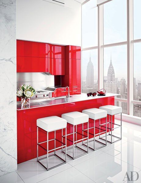
Red: Red is a color of passion and power. It demands attention and is usually used in spaces that are high in energy. When you see red, it usually creates alertness, and sometimes even caution, like in the case for traffic signs. Red is said to stimulate the appetite, which is why you might notice shades of red in some of your favorite restaurants.
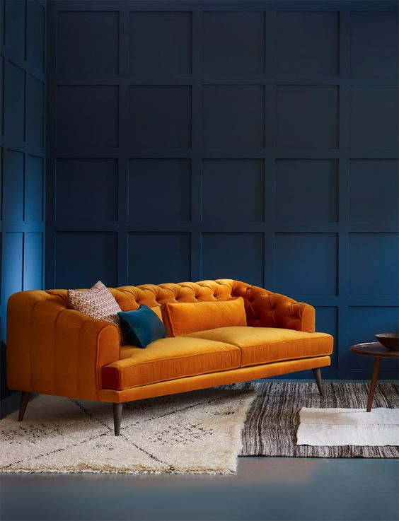
Orange: Orange is all about playfulness and friendly energy. It is a vibrant color, like red, but it is much more lighthearted and funky. Orange is inviting, young, and fresh. You don’t see orange too often in interior design, but when you do, it’s often in a space that’s funky, modern and bold.
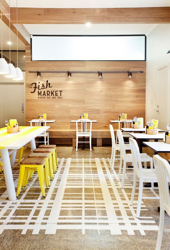
Yellow: Yellow is bold and energetic! Warm and inviting, cheerful and with a sense of happiness, yellow can inject a little brightness into any space. Yellow is also said to stimulate the appetite, so it’s common to use in restaurants, like red.
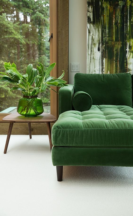
Green: Green is fresh and balanced. It evokes a natural quality, reminding us of the great outdoors. Green can also be associated with health, wealth and growth. It’s a color that signifies moving forward and with success.
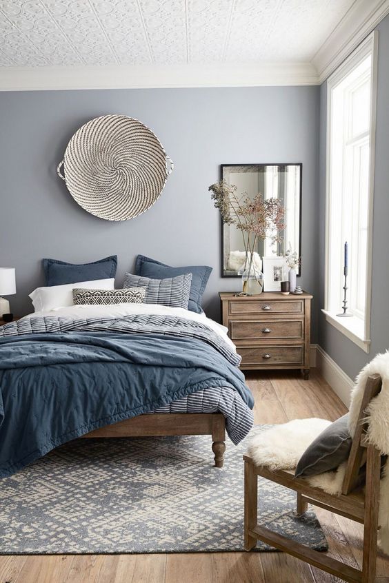
Blue: Blue is a naturally calming color, inducing tranquility and peace. It also signifies loyalty and trust, which is why a lot of corporate industries tend to use blue in their branding. Blue can be soothing, reminding us of the serenity of the ocean or a clear blue sky. Blue is a common color used in bedrooms, bathrooms, and spas.
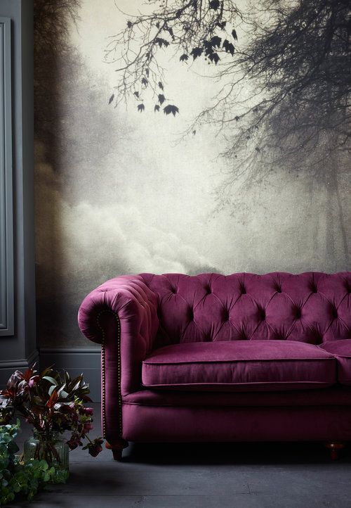
Purple: Purple inspires creativity and can represent royalty and spirituality. It creates a feeling of majesty, luxury, and serenity. Purple has a rich historical background, which makes it feel mysterious and wise when darker shades are used. Pastel shades tend to feel more feminine, yet still powerful and bold.
Pink: Pink is usually soft and delicate, but can also be very bold and bright in modern interior design. Pink has a light-heartedness to it that is often misjudged. When paired with the right colors, pink can be quite striking and attention-grabbing. It is also often associated with the health and beauty industry.
Take a look at some of the inspiration we’ve found below. As you can see, color can either make or break the atmosphere of the space you’re designing. If you’re planning a new day spa, you might want to steer clear of any bold reds, oranges or yellows and stick to a cooler, calmer color palette. If you’re planning a restaurant, you might opt to go the opposite route and choose those bold, bright shades of red. It always helps to define the function of your space first, and then start conceptualizing the color scheme. And as always, you can contact Amy Youngblood Interiors and we'll definitely help you sort through all of the color confusion!